

I had a knock on our front door a few weeks ago. It was a young English guy going door to door for an electricity retailer, trying to get me to switch my power company. As it turns out, it was his first day so he didn’t really know a lot about what he was selling and couldn’t answer many of my questions in detail. To be fair, I can be a bit analytical about these things and I don’t think he was prepared for so many questions. His spiel was basically “You should switch to us because we are better”, but when I asked about the rates they charge, all he could respond with was “We have really good rates”.
If you ever come knocking on my door, whether you’re trying to get me to switch energy companies, or convince me that Jesus loves me, you better be prepared to engage. I ask lots of questions. You better have answers.
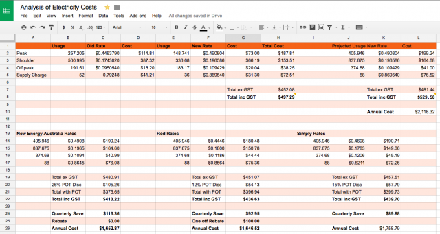
So I grabbed my most recent power bill, and asked him exactly what their rates were per KWh. He had never heard of a Time Of Use meter (TOU), which our house uses, so I had to explain the concepts of Peak, Shoulder and Off Peak rates to him. As we compared the rates, we both learned that his company’s “really good rates” were not quite as good as he had been led to believe. Compared to what we were currently paying, they were slightly cheaper for Peak and Shoulder, and quite a bit more for Off Peak. It was an interesting discussion and I told him I would take the data he provided and think about it.
When I think about data, I do it with a spreadsheet. I often amazes me how few people really understand the power of a spreadsheet to analyse numbers. Even with just a few simple formulas, it’s possible to dig into numbers and see what they really represent. Especially with consumer level data – like knowing how much things really cost – it astounds me that more people don’t know how to make sense of the numbers for their basic expenses.
So I knocked up a spreadsheet in Google Sheets. I transferred the KWh usage from my last power bill onto the sheet (which was a little tricky as there was a rate change part way through the quarter, so I had to calculate the different rate amounts and add them together for the total) but in the end was able to correctly derive the exact same $429 figure as I actually paid. Just that part of the exercise was useful as it helped me understand exactly how my power bill was calculated. (Do you understand how yours is calculated?) I then projected the amount of my next quarterly power bill – $529 – assuming the usage was the same, but with the latest rates.
Then I copied the usage data and plugged in the KWh rates being quoted to me by my door knocking friend. His company was offering a 15% pay-on-time discount on the bill (but only on the actual power usage, not the supply charge, as I found out later by reading the fine print). As it turns out, his company – Simply Energy – was indeed cheaper than my current provider, coming in at $439 for the same usage and a saving of $89.88. Not bad.
But wait, it got me thinking. Could I do even better? A quick internet search turned up a power provider called Red Energy. Red Energy was highly recommended by Canstar, so I found their rates and plugged them into my spreadsheet. Their KWh rates were cheaper, however they only offered a 10% pay-on-time discount, but it was on the whole bill not just the consumption component. Can you see why you really need a spreadsheet to analyse this data if you want to make any informed decisions? I’m sure that companies deliberately calculate their charges using different formulas to their competition, just to make it harder for consumers to make apples-to-apples comparisons. Thank goodness for spreadsheets and knowing how to use them.
Red Energy was not actually the cheapest option, but they were close enough and the one I felt best about as they are a 100% Australian owned company. So I called them, and made the switch.
And then the fun started. Yesterday I got a call from Energy Australia, my current power provider, telling me what a valued customer I am and how much they wanted to keep my business. So much so that they offered an ongoing 26% (!) pay-on-time discount on my power bill. While that certainly sounded like an attractive deal, their actual rates were still higher, so how can you tell? Yes, with a spreadsheet.
As the Energy Australia rep was wooing me with enticing offers I was able to say “Hang on, I have a spreadsheet!” I quickly entered their data into the sheet and was now discussing the options knowing exactly what I was talking about. Having data is powerful. Turns out it was a good deal, so I decided to remain with my original provider (although I was a little bit annoyed that you need to threaten to leave them before they suddenly discovered they can offer me a discount!)
Now I had to call Red Energy and tell them I was cancelling the switch. But, surprise surprise, Red has a customer retention department as well and they didn’t want to lose me as a potential new customer either. So they upped the ante to a 12% pay-on-time discount AND a $100 rebate on my next bill. Into the spreadsheet that new data went. And it turns out that when you take all of that into account, Red wins – by $6.34 annually. So I decided to stick with my decision to switch after all.
You can check out the spreadsheet I made here if you are interested.
I think there are a couple of lessons here…
- If you want to be a canny consumer, you need to have the facts. Many companies give you information that is confusing, incomplete or just misleading. Take the time to analyse the data for yourself so you know the reality of their claims.
- If you want to save money on basic bills, then leave your current provider (or at least threaten to). Switching your power, phone, gas, or other service to a competitor is likely to get their customer retention department calling with a much sweeter deal than you currently get.
- Learn to use a spreadsheet! They are a simple tool, but oh so powerful. I can tell you, at least anecdotally, that most people I meet have absolutely no idea how to use one. Don’t be one of those people.
- If buying locally matters to you at all, do some research. Turns out that Energy Australia, despite the name, is a wholly owned Hong Kong company. Red is 100% Australian owned by the Snowy Hydro Scheme. Foreign ownership of Australian companies is an interesting can of worms.
Here the educational part of this blog post…
As a teacher, I see this kind of thing as a brilliant activity for students. What if you gave your learners the basic skills of calculating numbers with a spreadsheet, and then a bunch of different rates from different competing companies and simply asked “Who is offering the best deal?” This process usually raises lots and lots of questions, and will certainly make them better consumers, better at understanding data, and better users of spreadsheets.
For an example of the kinds of ways you can take this convoluted consumer experience and turn it into a reasonably useful learning task for students, the links below are from a task I have used with my Year 11 students looking into how to figure out the best mobile phone plan. As you will see from looking at the task, it tried to take account of the complexities of the word “best” by introducing a user-centric approach (best for who?) and encouraging them to really dig into the information being provided to make sense of it. I’ve also included a grading rubric to give you an idea of how I graded this task.
- Choosing the Right Mobile Phone Plan – Task Description
- Choosing the Right Mobile Phone Plan – Supporting Slides
- Choosing the Right Mobile Phone Plan – Grading Rubric
![]() The Power Of Spreadsheets by Chris Betcher is licensed under a Creative Commons Attribution 4.0 International License.
The Power Of Spreadsheets by Chris Betcher is licensed under a Creative Commons Attribution 4.0 International License.
Aah – rubrics. What if a kid “You’ve used a range of different computer-based tools to complete this task” but didn’t submit in the correct file format?
In the bush, we don’t have the range of suppliers as you do. An interesting extension would be “Does (insert name of provider here) rip off country people? What deals can you get in the city that you can’t here??
Like the user-centric approach, but this is really defining the problem isn’t it?
Exactly. But if you look at the user’s you’ll see that problem is somewhat addressed. See the lawyer from Alice Springs. Or the sales rep from Rockhampton. All of that was added to increase the complexity. As for rubrics, well they are an imperfect instrument.
In answer to your rubric question Martin, I feel a bit the same way about rubrics. When you get two competing items in the same cell, it’s a matter of making a judgment on the overall quality of the work and weighing up which bits carry more influence on the finished product. If you use rubrics as a hard and fast marking guide then they can cause highly analytical types, who like everything to be 100% perfect, to get a nervous twitch when the rubric’s rigidity is breached.
The real value for the rubric (to me) is as a guide for the students so they know what I’m qualitatively looking for. By publishing it to them in advance, it sets a benchmark guide of sorts so they know what to aim for. And hopefully, the first time I compare their finished product to the grading rubric, is NOT the first time I’ve seen their work. Hopefully I’ve been giving them suggestions and feedback throughout the task, not just at the end, and it’s these feedback opportunities where you can point to the rubric and ask “so, where do you think you are on this criteria scale?” and talk about what they need to do to meet and exceed wherever they are at.
As a grading tool, for me, rubrics are meant to be a path to wander, not a track to run on.