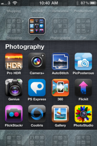
 With nearly two week down in the 365 Day Photography project I’m starting to get my head around some of the more useful tools for photography on the iPhone. There are lots of interesting photography apps to choose from in Apple’s App Store, and I’ve had a good play with many of them – something I probably wouldn’t have done if I didn’t have a project to focus on. That’s one of the reasons I like doing “projects”, and one the reasons that Project Based Learning works so incredibly well. When you have something to focus on, even something as innocuous as simply taking a photo each day, it opens up a whole range of new learning experiences.
This blogpost outlines some of the more useful and interesting iPhone photography apps I’ve been using (or plan to use).
Firstly, I should acknowledge that the camera in the iPhone 4 is pretty damn impressive to start with. It has its limtations, sure, but it really can take some pretty extraordinary photos if you work at it. It’s only 5 megapixels which is actually pretty good for a phone camera, but clearly less than a “real camera”. Mind you, I own a few “real cameras” and I usually step down the resolution as I rarely shoot anything I plan to turn into a poster size print. It’s perfectly adequate for my needs. In my opinon, it’s far more important to have good glass on a camera than it is to have super high megapixels numbers.
As an aside, the obsession with megapixels has always intruiged me… ignorant salespeople in consumer electronics stores will usually try to convince you that one camera is better than another based on higher megapixel numbers, but I think that’s really misleading. For most people, shooting at over 5 megapixels just consumes a lot of hard drive storage space for no real reason, and leads to excessive transfer times as they share their photos online to display at 72dpi! Anyway, better not get me started on that topic.
So, the most useful photos apps I’m using are…
HDR Pro
 I mentiond this a few posts ago, and I think it’s the single most used photography app I use. It takes 2 shots of the subject at two different exposure setting, then puts them together into a single image using the best exposure levels from both images. When it works well, the result is much closer to what the human eye sees, since the human eye typically has a much higher dynamic range than a camera. It lets you see detail in both the shadows and the brightly lit areas – something that a single shot always has to compromise with. If the contrast is too high, such as shooting into the sun, the results can get a bit odd looking as the merging algorithm struggles to blend the two extreme exposures together… you typically end up with a halo effect around the darker silhouetted shapes as it tries to smoothly blend light into dark. Sometimes HDR makes the photo look worse, but mostly it works really, really well.
It’s mentioning that although the iPhone 4 has HDR built into the standard camera app, it’s nowhere near as good as the HDR Pro app. I’ve read that Apple’s built in HDR takes three shots in rapid succession and then combines them, but I’ve heard other people say it’s actually simulated HDR. Either way, it’s just not as good as the dedicated HDR Pro app.
Camera+
 If you want to easily apply a range of special effects to your photos there are plenty of options to choose from. Camera+ (not to be confused with another app called Camera Plus) is the best I’ve found. It was masterminded by Lisa Bettany, an outstanding young photographer and iPhone developer, and it has lots of very cool looking effects built into it. For taking photos, it offers an image stabiliser, a timer and a burst mode for taking multiple shots in quick succession. Once the images are taken, they are sandboxed into their own storage environment called the LightBox, separate from the iPhone’s Camera Roll. In here, they can be edited in lots of ways from simple rotations and crops, to a sophisticated set of preset styles that might be just what you need to make your images look great. You can adjust the colour, retro, and special effects, and there’s also an in-app purchase option for additional analog-style film effects. Once edited, there is a range of fancy borders that can be added to the image to finish it off. When you’re done making changes to the image it can then be exported out of the LightBox and back to the Camera Roll where the photos are normally kept on the iPhone.
It’s actually pretty amazing to see what sort of image processing power is available now on a device that fits in your pocket. Not so long ago, you needed Photoshop running on a fairly grunty desktop PC to do this sort of stuff, but now you can shoot and edit full resolution photos with the same sorts of effects and filters that Photoshop provides, all on your phone. It’s pretty impressive really, and makes you wonder what the next few years of intense development in the mobile space will bring.
Photoshop Express
 Speaking of Photoshop, yes, you can get a version for your phone! Adobe makes Photoshop Express and it offers a range of manipulation tools for improving your images. As well as the basic crop, rotate, straighten and flip tools, you can makes adjustments to the exposure, saturation, tint and contrast, convert a colour image to black and white, apply blur and sharpen filters, as well as a bunch of borders and special effects. It sounds similar to Camera+, but where Camera+ tends to bundle a whole lot of effects together into different visual styles you can apply, Photoshop Express allows you to apply and manipulate each effect individually. There are no control sliders as such… to vary the amount of an effect you just drag a finger left or right on the screen itself, which is actually a pretty neat interface for a mobile device.
PhotoStudio
 If you want to delve into a whole lot of sophisticated effects and filters for your images, check out PhotoStudio. It has an extensive collection of 181 different filters that can be easily applied individually or collectively, as well as being favourited or grouped together into effect styles. It’s like Photoshop Express on steriods, and anyone familiar with the Filters menu in the full version of Photoshop will recognise many of the effects this mobile app offers. I think they need to redesign their overly cutesy main interface, but the quality of the filters this app offers is very impressive.
ColourSplash
 Ever seen those images that are all in black and white except for one thing that’s in colour? That’s exactly what ColorSplash lets you create. Take a shot, then the app converts it to black and white and lets you paint back in the colour wherever you want it. It can be a little tedious if you want to get right into the detail, since you have to pinch and pan and zoom to navigate around the image as you paint, but it gives you a lot of control over the process. I’ve seen other apps that do a reasonable job of auto-masking for you, but they never seem to get it quite perfect. Doing it yourself is a little more work, but I think you get a much better result.
Retro Camera Plus
 If you want to go for some old style photo action, then give Retro Camera Plus a shot. It provides five different classic old camera styles – The Barbl, The Little Orange Box, the Xolaroid 2000, the FudgeCan, and even a Pinhole Camera. Each of these classic effects has a built in set of filters and styles that simulate the effects of film, and can provide some really interesting aged looks to your images. Great for experimenting with different looks and feels for your photos, or just kickin’ it old school!
Autostitch Panorama
 AutostitchPanorama enables you to shoot a series of images, left to right, overlapping slightly, which it then brings together into a single panoramic image. It seems to do a great job of compensating for the varying exposures that you inevitably get as you rotate the camera around at different angles to the light, and the final product always seems to have a really smooth exposure transition. Great for scenery and other very wide shots and definitely the best results of any of the panoramic apps I’ve tried so far.
360 Panorama
 360 Panorama does a similar thing to Autostitch in that it makes panoramic images, but it does it in a different, but very interesting, way. You activate the app and then simply pan your camera around in a full 360 degrees and it “imprints” the scene into the panorama as you move around. There’s no post processing involved, it does it all in real time. It also has a feature that can Tweet the photo to your Twitter account, linking to both the panoramic image as well as a dynamic 360, rotatable version of the scene using its own custom VR player. It does take a bit of practice to get a decent result, but when you get it right the results are amazing!
PocketBooth
 Remember those old style photo booths that you’d sit in with your friends? You’d put a coin in, pull the curtains shut and smile, and it would spit out on a long strip of four grainy black and white images. That’s exactly what PocketBooth does. I have such fond memories of those photo booths growing up with my friends… It gives you exactly the same sort of grainy image quality those old photo booths gave, shot in a 4-up filmstrip mode, and I really like the look of the final product. Well worth a look.
PicPosterous
 As well as taking the photos, you also need to get them online to share them. For my own 365 Day Photo project, I’ve been using the excellent Posterous blogging platform. Posterous (which by the way is, according to the developers of the site, pronounced with a short “o” sound as in “preposterous”, because it’s preposterously easy to use) The neat thing about Posterous is that really is preposterously easy to use – you can create new posts simply by sending an email to the service and it will take your text, images, audio, video and package them up into a neatly presented blog post with no further intervention from you. I’ve been getting lots of our teachers at school creating class blogs using Posterous because it’s just so darn easy to use.
The other cool thing is that it Autoposts on to other services. So, once your post goes online at Posterous, it can then automatically crosspost to WordPress, Flickr, Twitter, Facebook, and about a dozen other online services of your choice… all this from a single email! It also generates all the RSS feeds, so if you email audio files it can create podcast feeds really easily as well. It truly is an amazing, friction-free service and is perfectly suited to a project like 365 Day photos. If you don’t have your own free Posterous account, go get one now!
The PicPosterous app takes this ease of use even further by providing an interface specifically for adding photos to your Posterous blog. Just select the photo, write an optional short description about it and tap send. Done. In my case, it adds the photo to the blog then also crossposts to Facebook, Buzz, Flickr, Picasa and Identica. (I’ve noticed that they are also turning up in Twitter as well… not sure how that’s happening, I suspect that I may have originally told Identica to crosspost to Twitter… it does get a little confusing if you don’t keep track of these things!
FlickIt
 If you’d rather do it the regular way, you can always just upload your photos to Flickr directly (although I don’t know why you wouldn’t just let PicPosterous do it for you) Enter FlickIt, a very easy to use uploader from your iPhone to Flickr. The nice thing about FlickIt is that it gives you the option to add tags to your images (something I really wish PicPosterous did) as well as a description and title. Easy to use, reliable, and great for photos that you aren’t adding to a daily photo blog but you simply want to get up on Flickr.
Project 365
 I didn’t discover this app until after I started my daily photo project, but its an app made especially for doing 365 day photo projects. It has a calendar style interface where you add a photo each day, filling the calendar squares with images over time. It also uploads your images to its own online service. It’s a nice idea. Although I don’t use it for my project directly, I do use it to keep a running record of my photos so I can see that I post each day. Although it involves a second process on top of the main upload to Posterous, it only takes a few seconds to do and it keeps me on track (since missing a day would leave a blank spot on the calendar, and that would really bug me!) It provides a good overview of all the photos I take for the project, and it also creates a daily reminder to take a photo which has been handy.
So there you go, that’s a quick peek into some of the more useful photography apps I’ve found for the iPhone. There are others I own that I haven’t mentioned, and of course there are probably lots of others I don’t know about. It really is pretty amazing what a “camera phone” is capable of these days, and you only have to look at some of the images being taken as part of all the 365 Projects that people are doing this year to realise that we’ve entered a really interesting time for mobile photography. The fact that so many people I know are doing the photo-a-day challenge is also testament to just how easy it is now to publish regular content online.
If you have suggestions for other photo apps you’ve found handy, please take a moment to drop it into the comments so we can all learn from each other. And keep taking lots of photos!

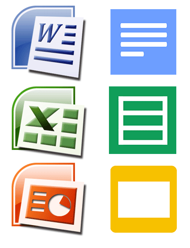 Like many schools around the world, our school has used the Microsoft Office trio of Word, Excel and PowerPoint for many years. Most of us know Word, Excel and PowerPoint well enough for our daily tasks. Although some of us might be willing to admit we probably don’t use it to its full capacity, we’ve been using it for so long that we don’t stop to think much about what, if any, alternatives might be out there.
 With nearly two week down in the
 If you want to easily apply a range of special effects to your photos there are plenty of options to choose from. Camera+ (not to be confused with another app called Camera Plus) is the best I’ve found. It was masterminded by
  Speaking of Photoshop, yes, you can get a version for your phone! Adobe makes Photoshop Express and it offers a range of manipulation tools for improving your images. As well as the basic crop, rotate, straighten and flip tools, you can makes adjustments to the exposure, saturation, tint and contrast, convert a colour image to black and white, apply blur and sharpen filters, as well as a bunch of borders and special effects. It sounds similar to Camera+, but where Camera+ tends to bundle a whole lot of effects together into different visual styles you can apply, Photoshop Express allows you to apply and manipulate each effect individually. There are no control sliders as such… to vary the amount of an effect you just drag a finger left or right on the screen itself, which is actually a pretty neat interface for a mobile device.
 If you want to delve into a whole lot of sophisticated effects and filters for your images, check out PhotoStudio. It has an extensive collection of 181 different filters that can be easily applied individually or collectively, as well as being favourited or grouped together into effect styles. It’s like Photoshop Express on steriods, and anyone familiar with the Filters menu in the full version of Photoshop will recognise many of the effects this mobile app offers. I think they need to redesign their overly cutesy main interface, but the quality of the filters this app offers is very impressive.
 Ever seen those images that are all in black and white except for one thing that’s in colour? That’s exactly what ColorSplash lets you create. Take a shot, then the app converts it to black and white and lets you paint back in the colour wherever you want it. It can be a little tedious if you want to get right into the detail, since you have to pinch and pan and zoom to navigate around the image as you paint, but it gives you a lot of control over the process. I’ve seen other apps that do a reasonable job of auto-masking for you, but they never seem to get it quite perfect. Doing it yourself is a little more work, but I think you get a much better result.
 If you want to go for some old style photo action, then give Retro Camera Plus a shot. It provides five different classic old camera styles – The Barbl, The Little Orange Box, the Xolaroid 2000, the FudgeCan, and even a Pinhole Camera. Each of these classic effects has a built in set of filters and styles that simulate the effects of film, and can provide some really interesting aged looks to your images. Great for experimenting with different looks and feels for your photos, or just kickin’ it old school!
 AutostitchPanorama enables you to shoot a series of images, left to right, overlapping slightly, which it then brings together into a single panoramic image. It seems to do a great job of compensating for the varying exposures that you inevitably get as you rotate the camera around at different angles to the light, and the final product always seems to have a really smooth exposure transition. Great for scenery and other very wide shots and definitely the best results of any of the panoramic apps I’ve tried so far.
 360 Panorama does a similar thing to Autostitch in that it makes panoramic images, but it does it in a different, but very interesting, way. You activate the app and then simply pan your camera around in a full 360 degrees and it “imprints” the scene into the panorama as you move around. There’s no post processing involved, it does it all in real time. It also has a feature that can Tweet the photo to your Twitter account, linking to both the panoramic image as well as a dynamic 360, rotatable version of the scene using its own custom VR player. It does take a bit of practice to get a decent result, but when you get it right the results are amazing!
 Remember those old style photo booths that you’d sit in with your friends? You’d put a coin in, pull the curtains shut and smile, and it would spit out on a long strip of four grainy black and white images. That’s exactly what PocketBooth does. I have such fond memories of those photo booths growing up with my friends… It gives you exactly the same sort of grainy image quality those old photo booths gave, shot in a 4-up filmstrip mode, and I really like the look of the final product. Well worth a look.
 As well as taking the photos, you also need to get them online to share them. For my own 365 Day Photo project, I’ve been using the excellent
  If you’d rather do it the regular way, you can always just upload your photos to Flickr directly (although I don’t know why you wouldn’t just let PicPosterous do it for you) Enter FlickIt, a very easy to use uploader from your iPhone to Flickr. The nice thing about FlickIt is that it gives you the option to add tags to your images (something I really wish PicPosterous did) as well as a description and title. Easy to use, reliable, and great for photos that you aren’t adding to a daily photo blog but you simply want to get up on Flickr.
 I didn’t discover this app until after I started my daily photo project, but its an app made especially for doing 365 day photo projects. It has a calendar style interface where you add a photo each day, filling the calendar squares with images over time. It also uploads your images to its own online service. It’s a nice idea. Although I don’t use it for my project directly, I do use it to keep a running record of my photos so I can see that I post each day. Although it involves a second process on top of the main upload to Posterous, it only takes a few seconds to do and it keeps me on track (since missing a day would leave a blank spot on the calendar, and that would really bug me!) It provides a good overview of all the photos I take for the project, and it also creates a daily reminder to take a photo which has been handy.